
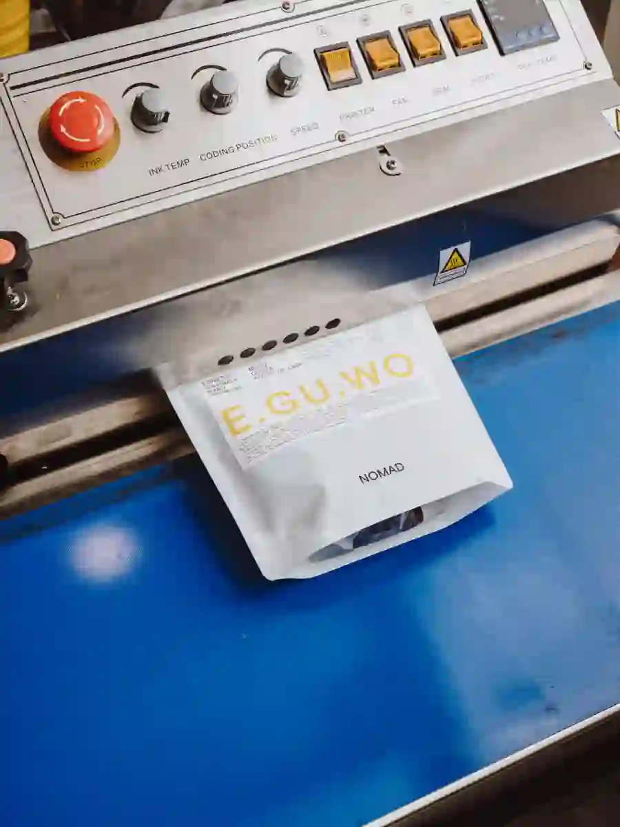
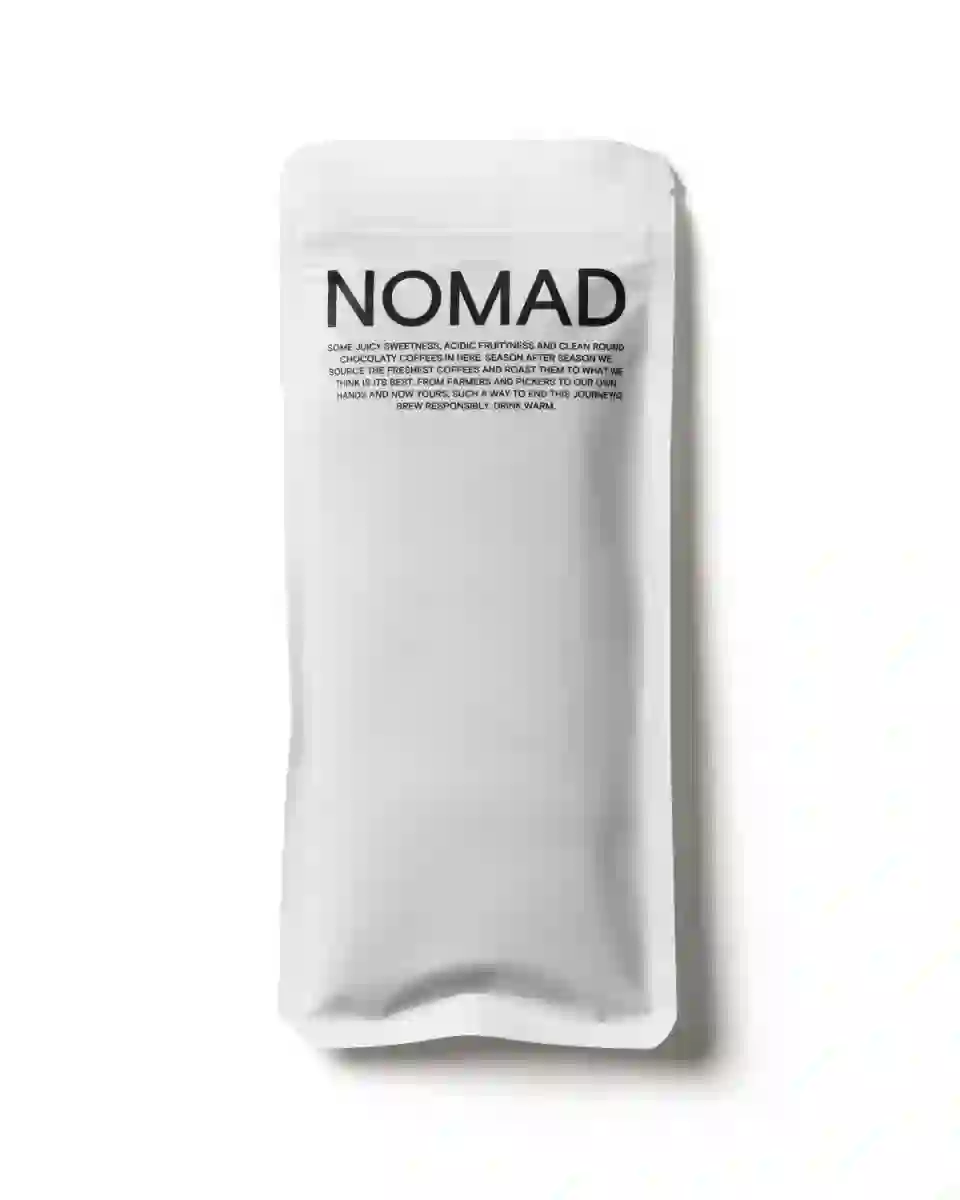
New 250gr bag 2023
1 - 34
250gr labels visual system.
2 - 34
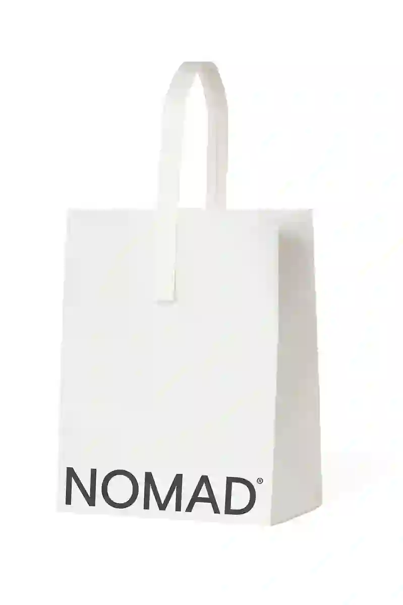
Paper bag.
3 - 34
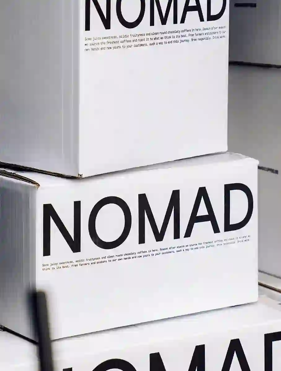
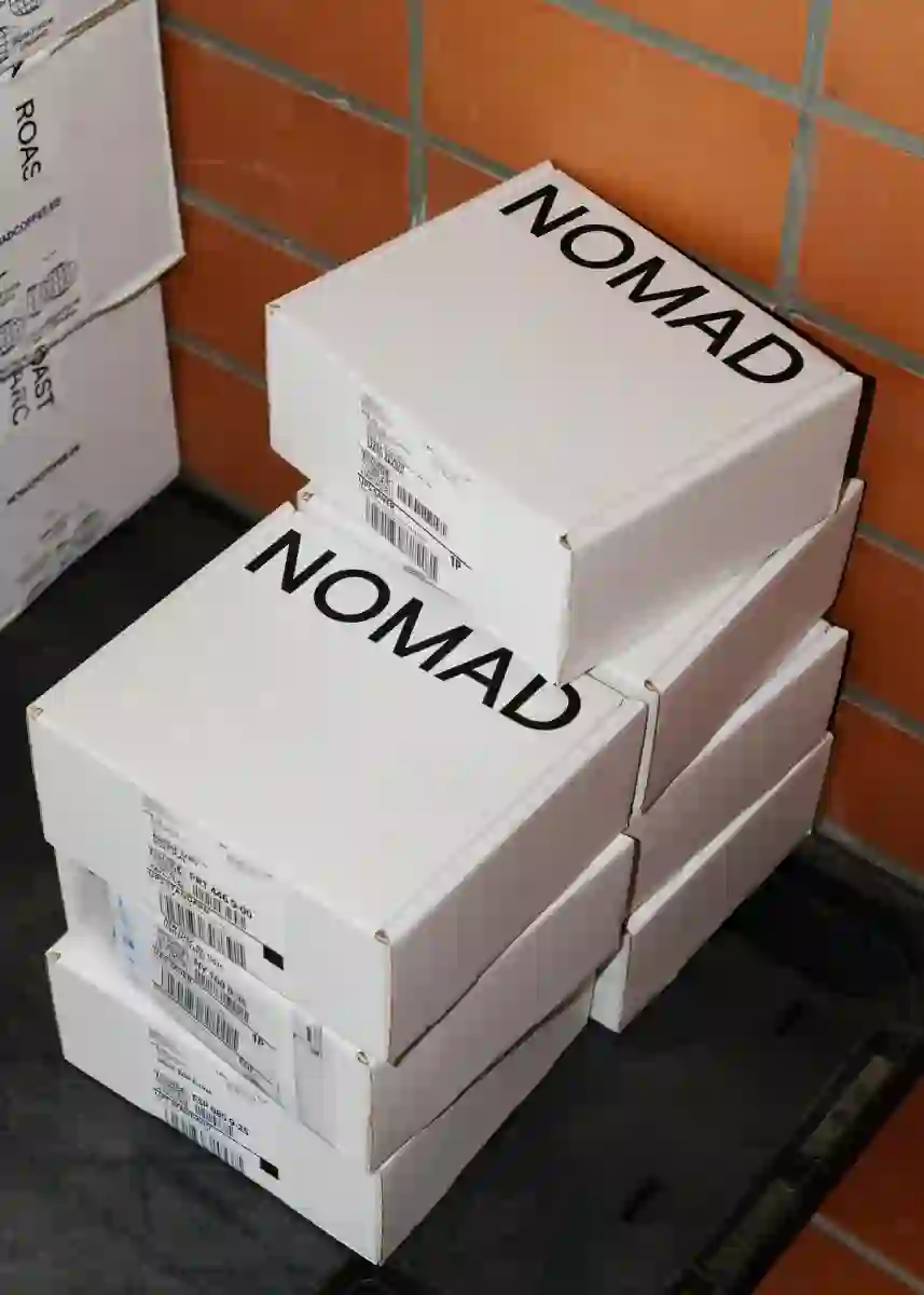
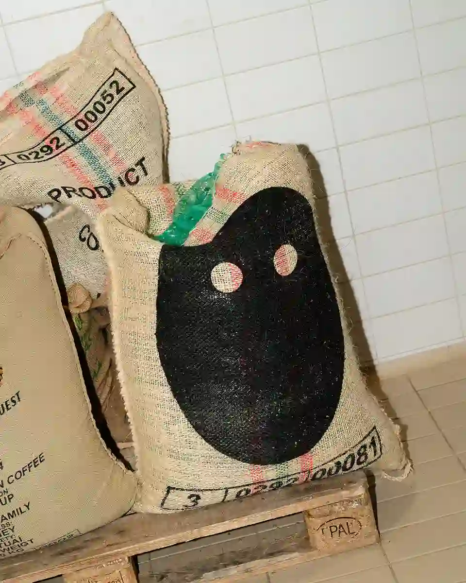
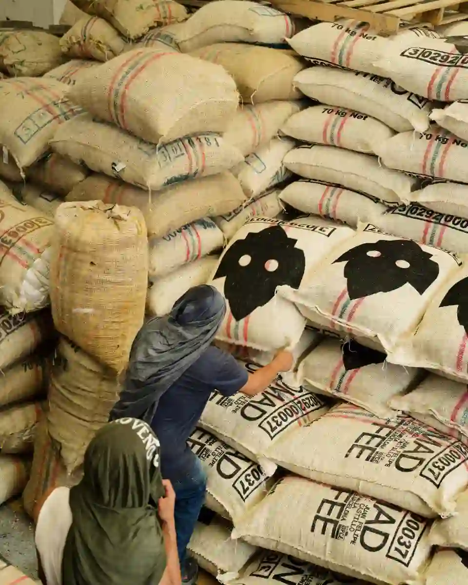
Boxes
4 - 34
5 - 34
6 - 34
Communication asset.
7 - 34
Special labels 4 processes.
8 - 34
Samples bag
9 - 34
Barista pro campaign.
10 - 34
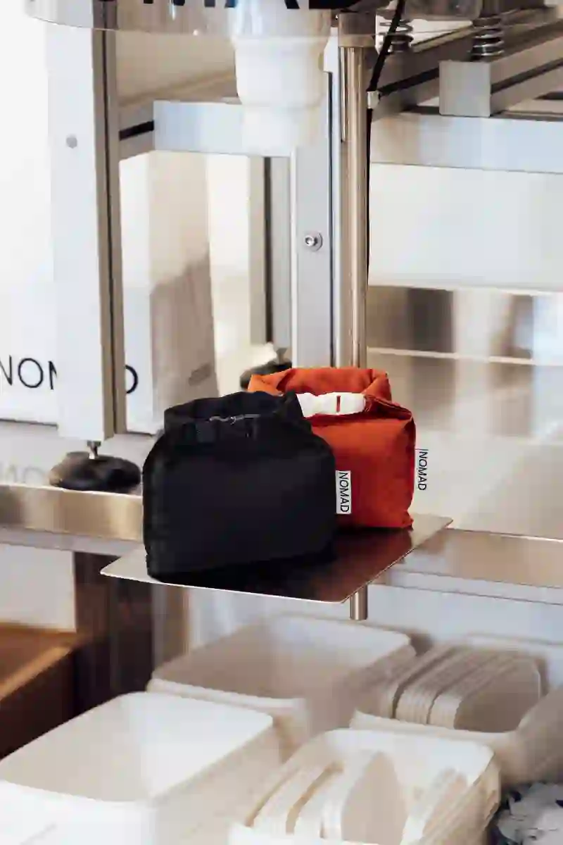
Nomad campaign. ©Enric Badrinas
11 - 34
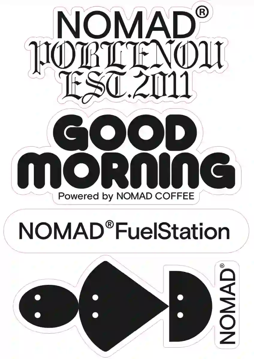
Stickers for coffee dealers.
12 - 34
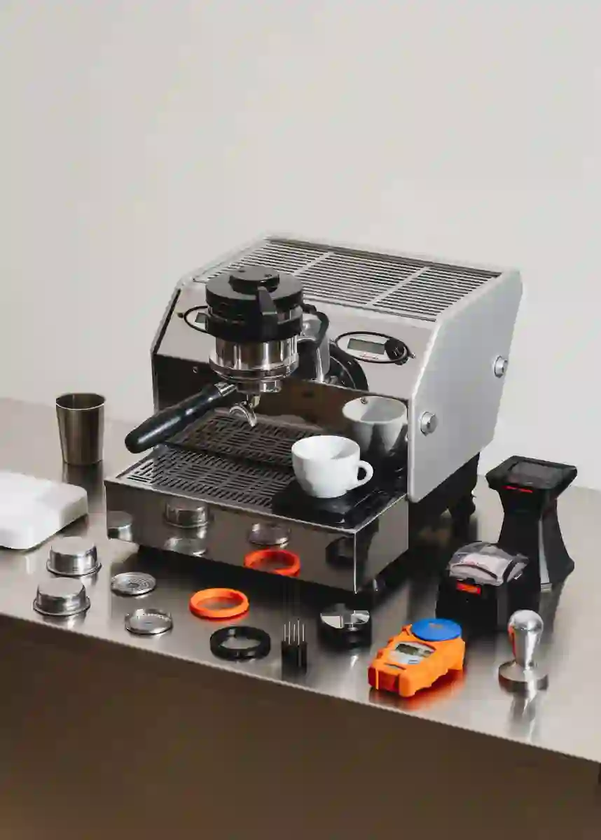
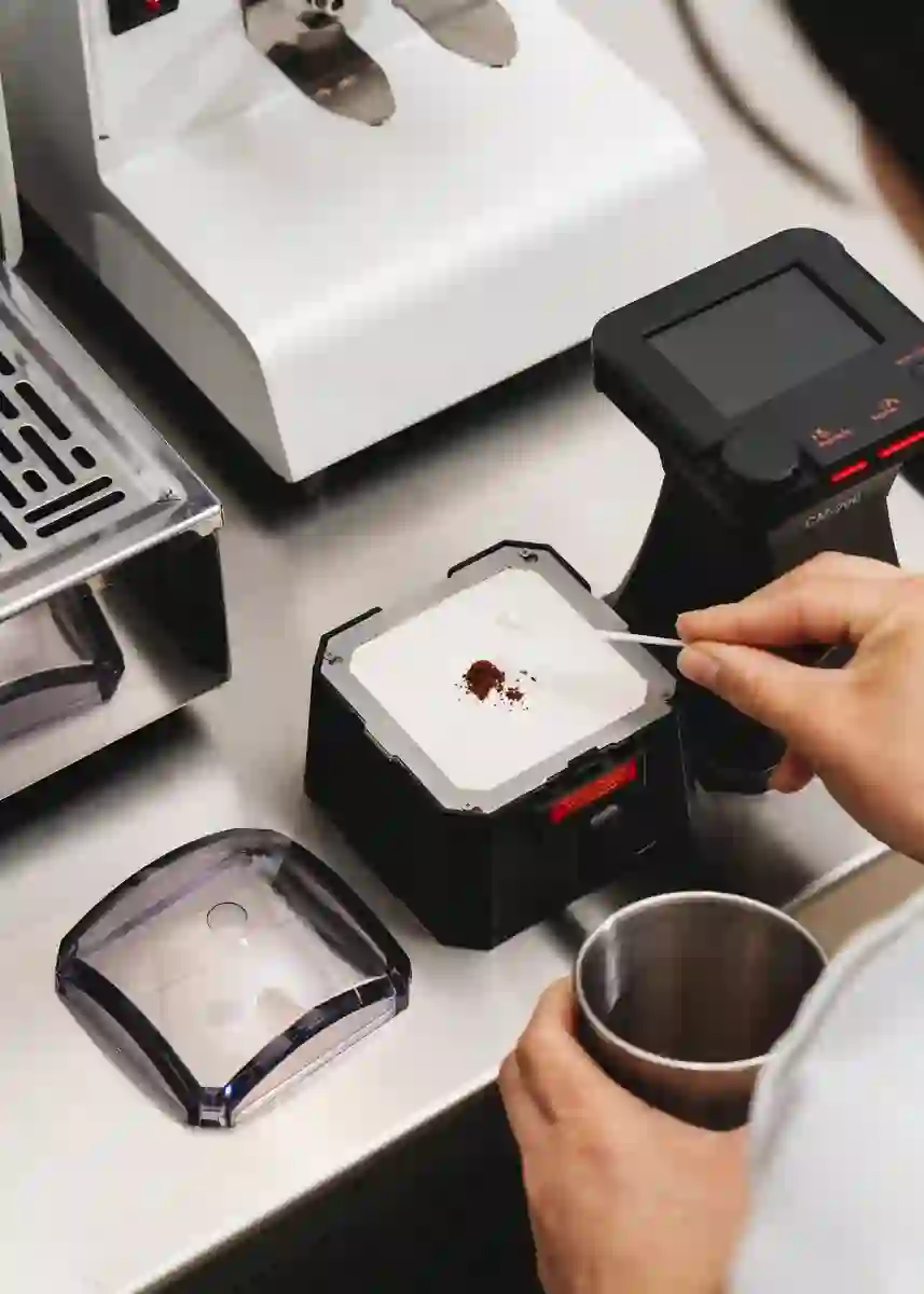
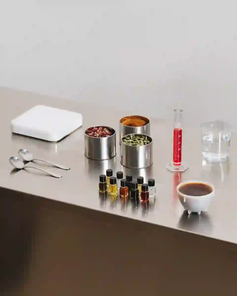
Geeky coffee tools communication.
13 - 34
14 - 34
Coffee Bags modular design
15 - 34
Custom farm coffee bags
16 - 34
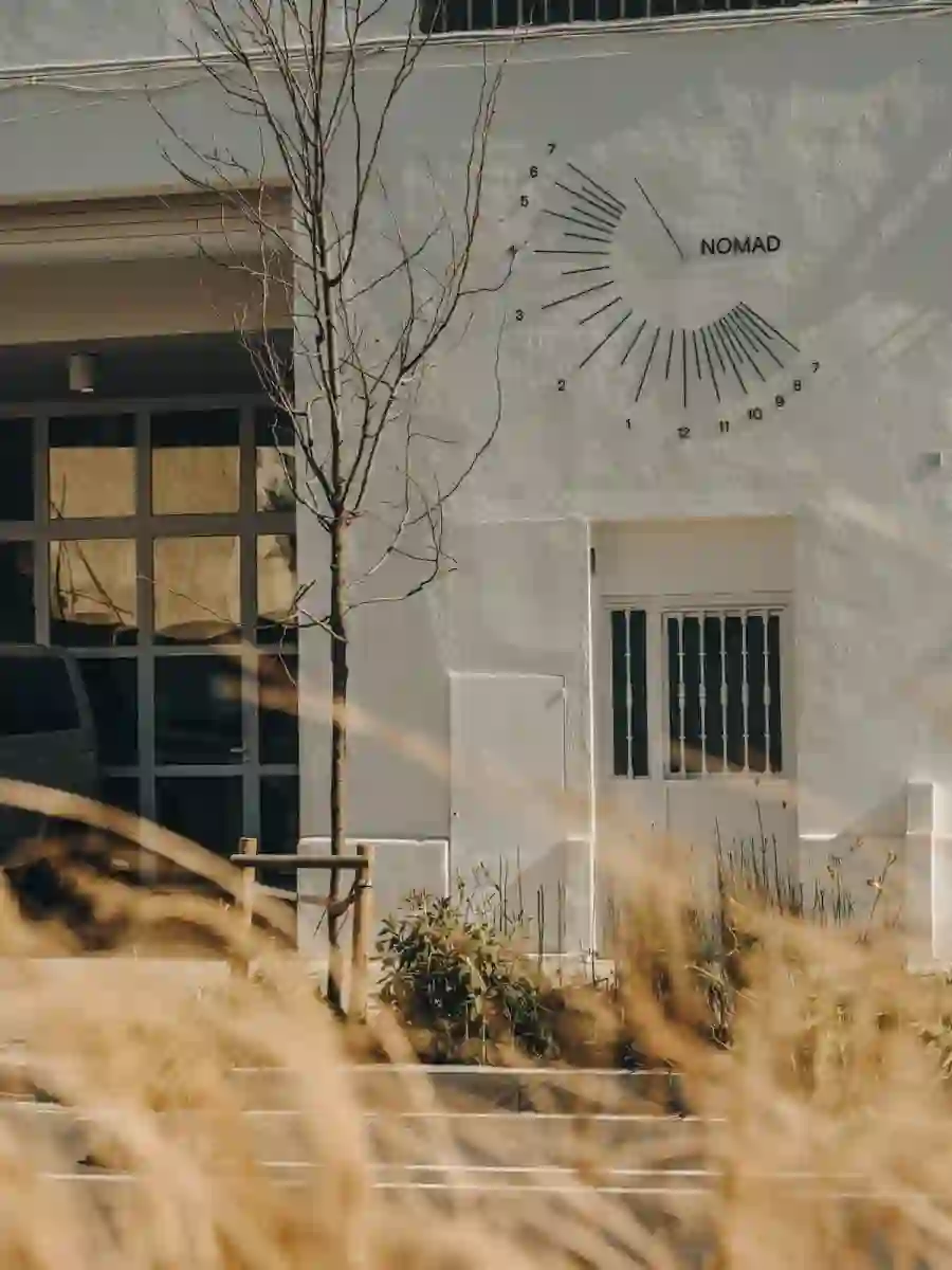
Factory signage sun clock. ©Salva López
17 - 34
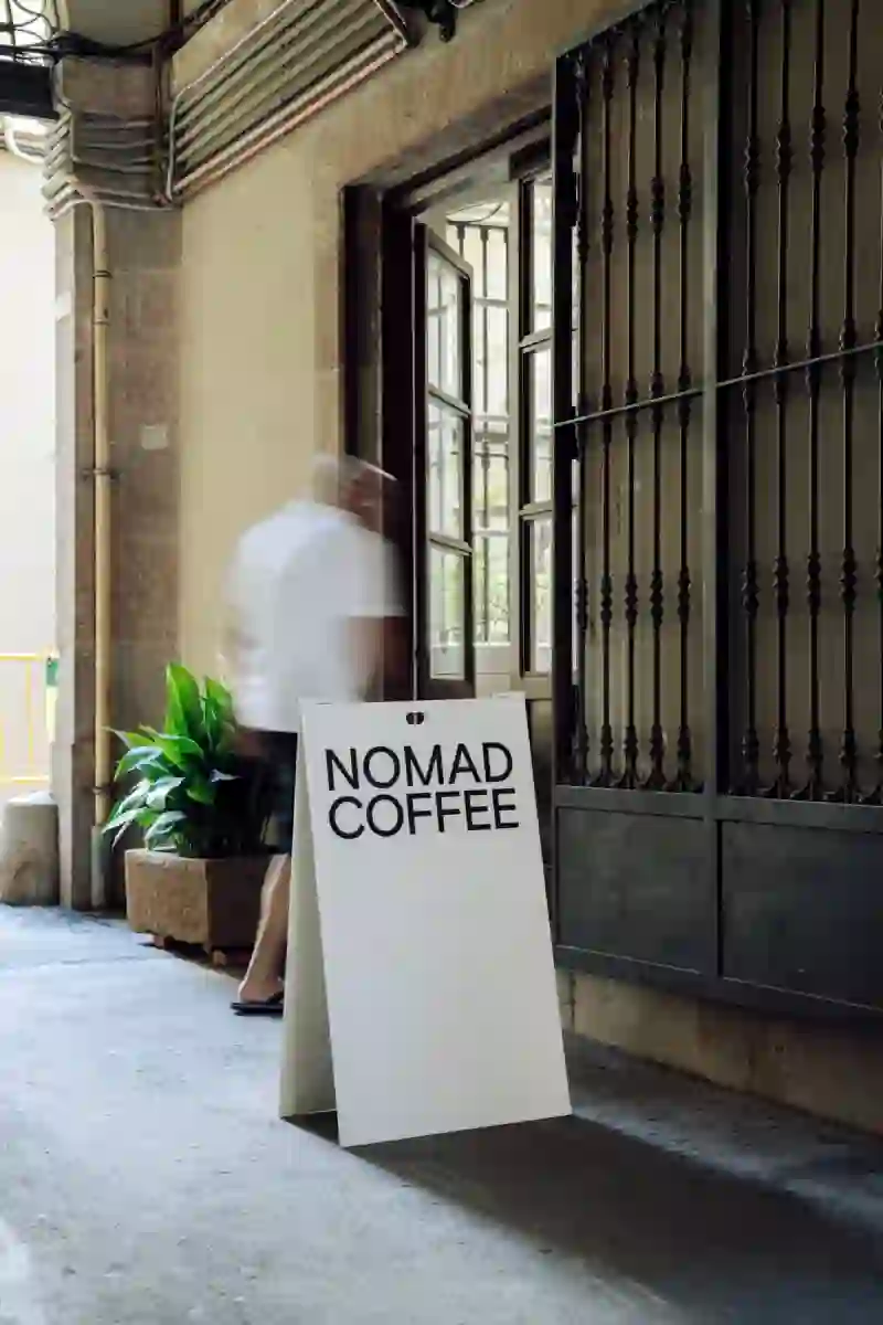
Nomad Passatge Sert Sign.
18 - 34
Nomad coffee lab interior design detail.
19 - 34
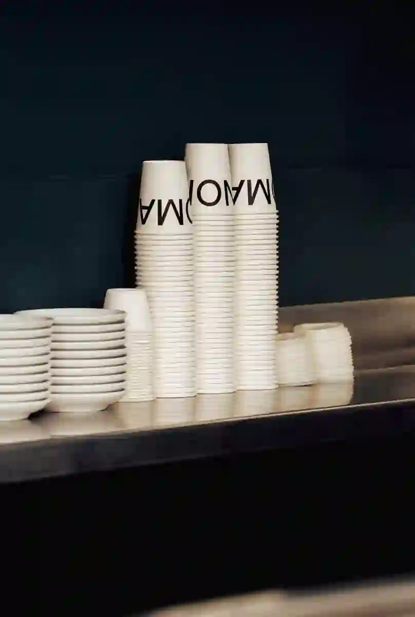
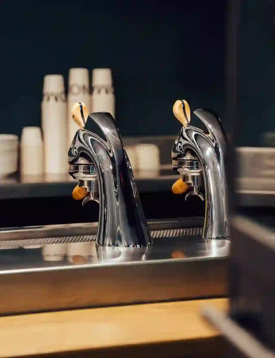
Take away cups.
20 - 34

Limited edition coffee packs.
21 - 34
Tasting notes icons collection.
22 - 34
Tasting notes icons.
23 - 34
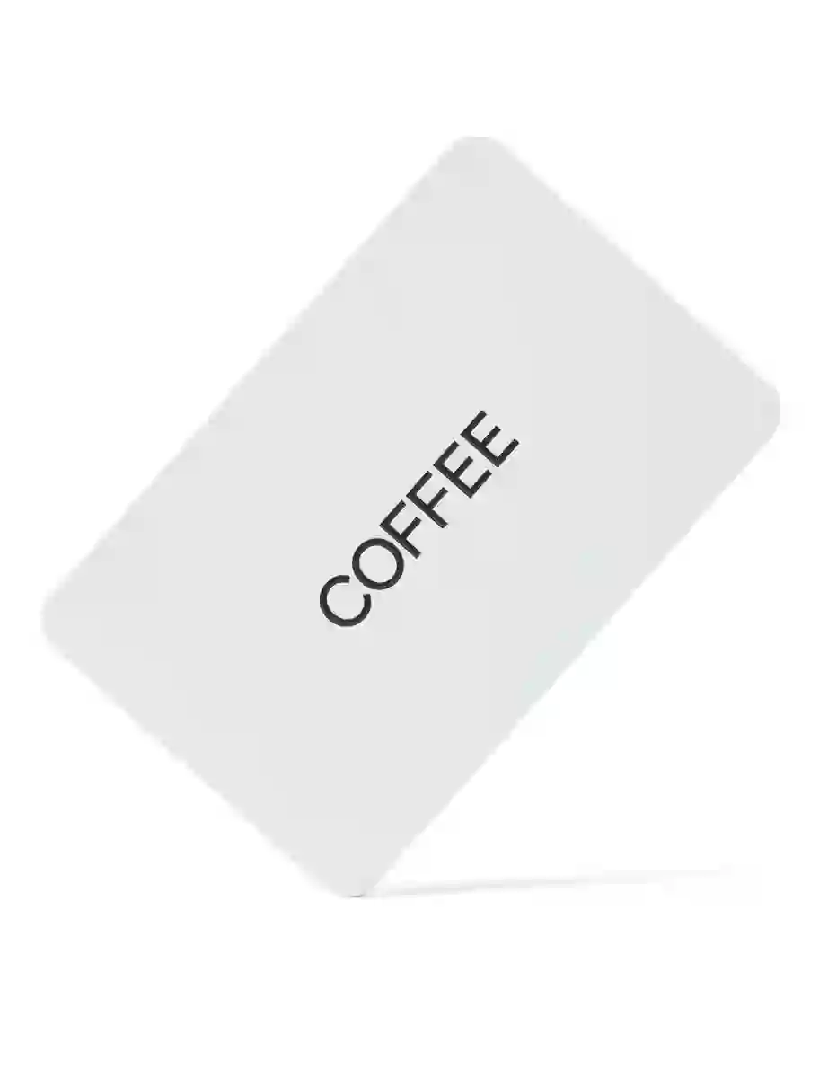
Nomad gift card.
24 - 34
Tote bag designed together with Julia Esqué.
25 - 34
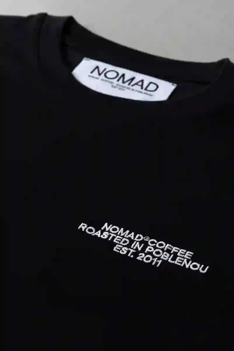
Nomad t-shirts.
26 - 34
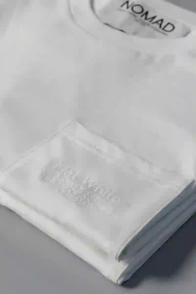
Flat white collection.
27 - 34
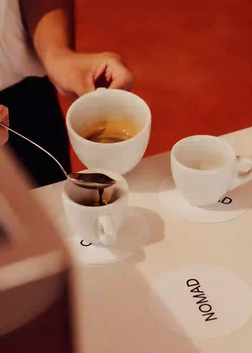
Coffee courses.
28 - 34
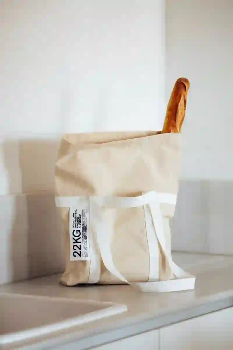
Reusable coffee bag.
29 - 34
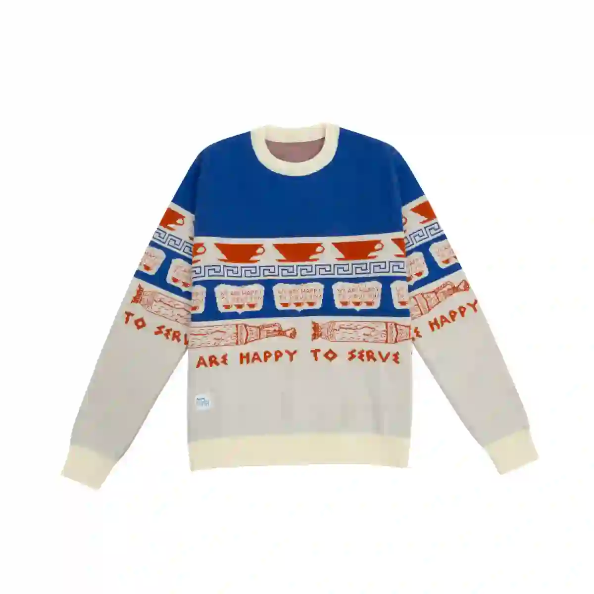
Nomad sweater collab with Brava.
30 - 34
© Enric Badrinas
31 - 34
Nomad school campaign.
32 - 34

Nomad coffee barista contest trophy design. With Gerard Tejero.
33 - 34
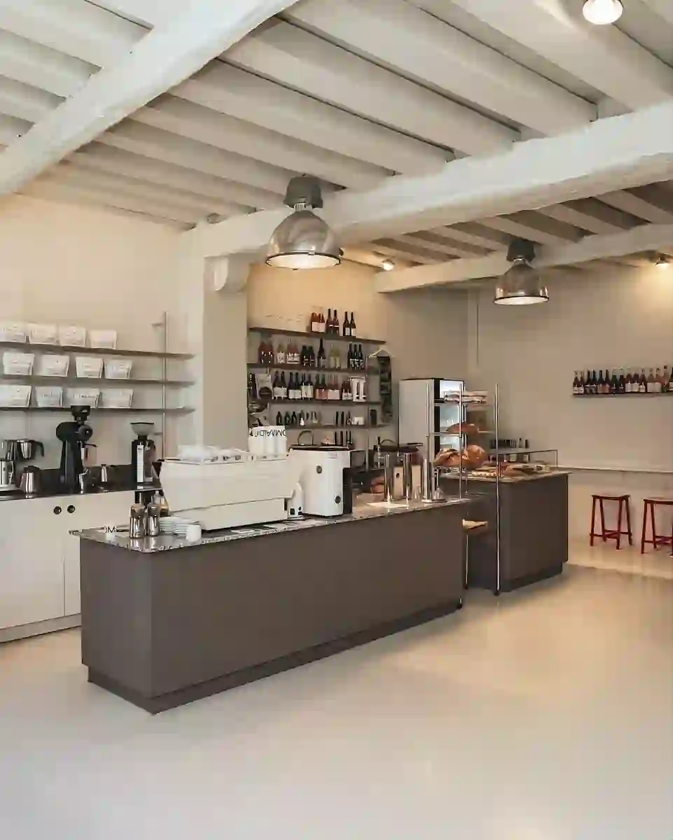
Nomad shop. Interior design by Júlia Esqué & Jaume Ramirez.
34 - 34
ENG
Since 2016, we have been responsible for the strategy and creative direction of Nomad Coffee.
The project began with a comprehensive rebranding, including communication strategy, packaging design for coffee and transport, interior design and signage for cafés, website development, online and offline communication, merchandising, and all other aspects related to the brand.
Over the years, we have created numerous pieces and campaigns that have established Nomad as a global reference—not only in the coffee industry but also as a design icon.
OUR INITIAL STRATEGY REDEFINED NOMAD'S POSITIONING.
We moved the brand away from the conventional coffee narratives, often associated with artisanal work, rural settings, and natural elements. While respecting nature and prioritizing sustainable production processes and traceability, we avoided clichés.
Instead, we placed Nomad in a contemporary space. After all, being eco-conscious does not necessarily mean conveying the image of working in the fields or manually filling coffee bags. The specialty coffee industry merges both natural and technical aspects to create outstanding products. A modern coffee roastery resembles a laboratory more than a warehouse.
To reflect this reality, we positioned Nomad as a “coffee laboratory”, carving out a unique and unexplored space within the competitive landscape.
WE DEVELOPED A CLEAN AND CONTEMPORARY GRAPHIC SYSTEM.
Neutrality and laboratory-inspired elements were essential to the visual identity. White became the primary color, complemented by black and a vibrant palette used to categorize products.
PACKAGING BECAME THE CORNERSTONE OF THE BRAND IDENTITY.
We created a proprietary classification system to make Nomad’s packaging easily recognizable and distinct from the competition. This approach extended to other brand elements, always aligned with sustainability and local sourcing principles.
For example, the coffee cups are handcrafted by a local ceramicist, and all packaging materials are fully compostable.
CAT
DES DEL 2016, SOM RESPONSABLES DE L’ESTRATÈGIA I LA DIRECCIÓ CREATIVA DE NOMAD COFFEE.
El projecte va començar amb un rebranding integral que va incloure l’estratègia de comunicació, el disseny dels envasos per al cafè i el transport, el disseny interior i la senyalització de les cafeteries, el desenvolupament del lloc web, la comunicació en línia i fora de línia, el marxandatge i tots els altres aspectes relacionats amb la marca.
Al llarg dels anys, hem creat nombroses peces i campanyes que han consolidat Nomad com una referència global, no només en el sector del cafè, sinó també com un icona del disseny.
LA NOSTRA ESTRATÈGIA INICIAL VA REDEFINIR EL POSICIONAMENT DE NOMAD.
Vam allunyar la marca dels territoris convencionals del cafè, sovint associats amb el treball artesanal, el camp i els elements naturals. Tot i respectar la natura i prioritzar processos de producció sostenibles i la traçabilitat, vam evitar els clixés.
En lloc d’això, vam situar Nomad en un espai contemporani. Al cap i a la fi, ser eco-conscient no implica necessàriament transmetre la imatge de treballar al camp o d’omplir manualment les bosses de cafè. La indústria del cafè d’especialitat combina aspectes naturals i tècnics per crear productes excel·lents. Un torrador modern s’assembla més a un laboratori que a un magatzem.
Per reflectir aquesta realitat, vam posicionar Nomad com un “laboratori de cafè”, obrint un espai únic i inexplorat dins del paisatge competitiu.
VAM DESENVOLUPAR UN SISTEMA GRÀFIC NET I CONTEMPORANI.
La neutralitat i les referències a un laboratori van ser elements essencials de la identitat visual. El blanc es va convertir en el color principal, combinat amb el negre i una paleta vibrant utilitzada per categoritzar els productes.
ELS ENVASOS ES VAN CONVERTIR EN LA PEDRA ANGULAR DE LA IDENTITAT DE LA MARCA.
Vam crear un sistema de classificació propi per fer els envasos fàcilment reconeixibles i diferenciats de la competència. Aquest enfocament es va estendre a altres elements, sempre alineats amb els criteris de sostenibilitat i proximitat de la marca.
Per exemple, les tasses de cafè són elaborades per un ceramista local, i tots els materials dels envasos són compostables.