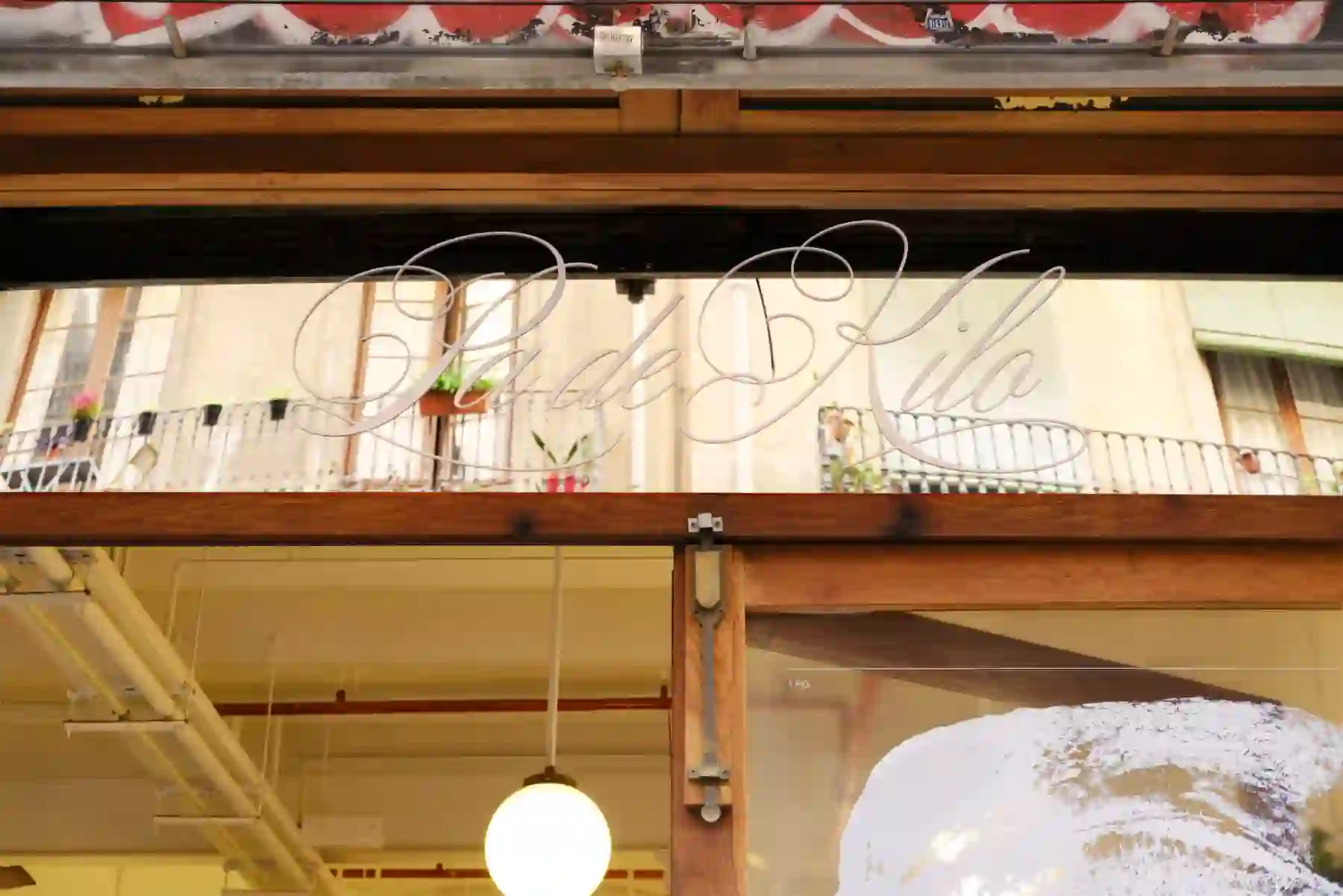
Fromt door sign
1 - 8
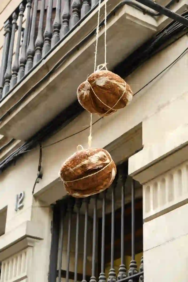
Flag
2 - 8
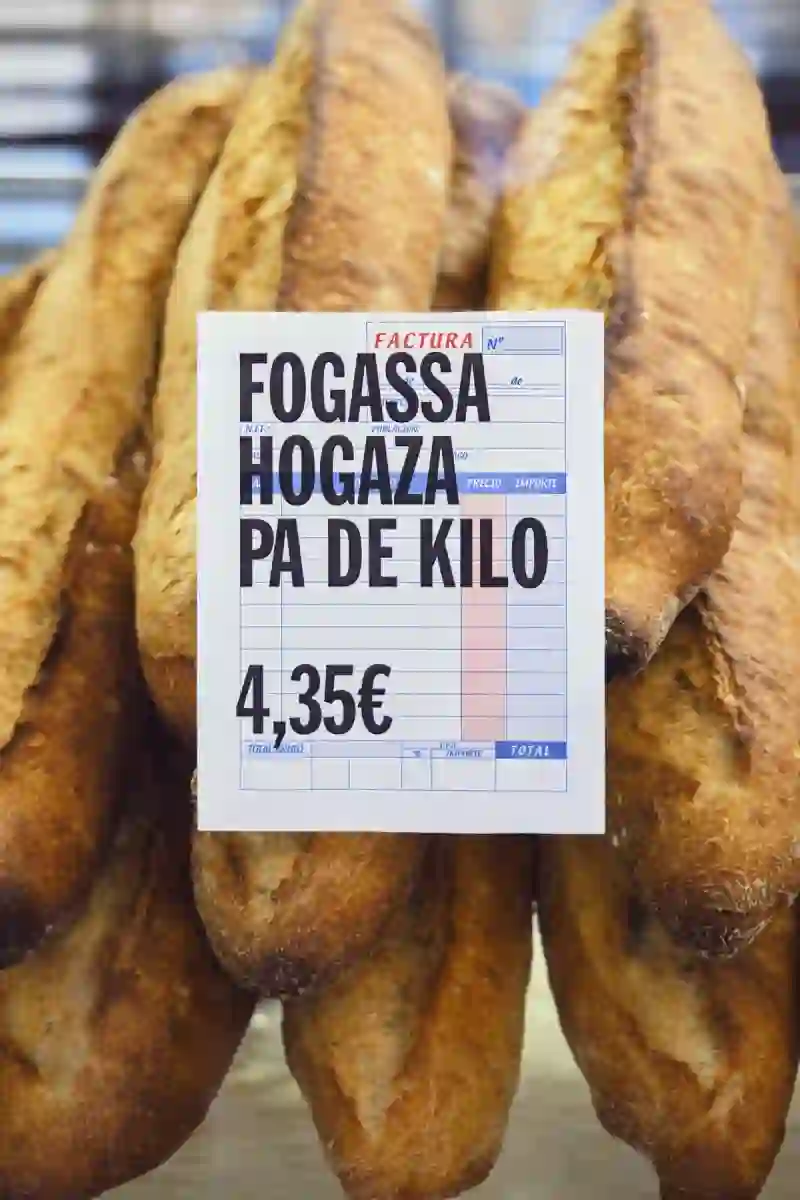
Prices
3 - 8
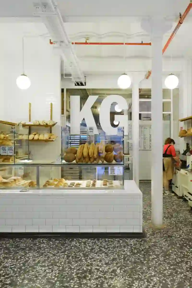
Shop
4 - 8
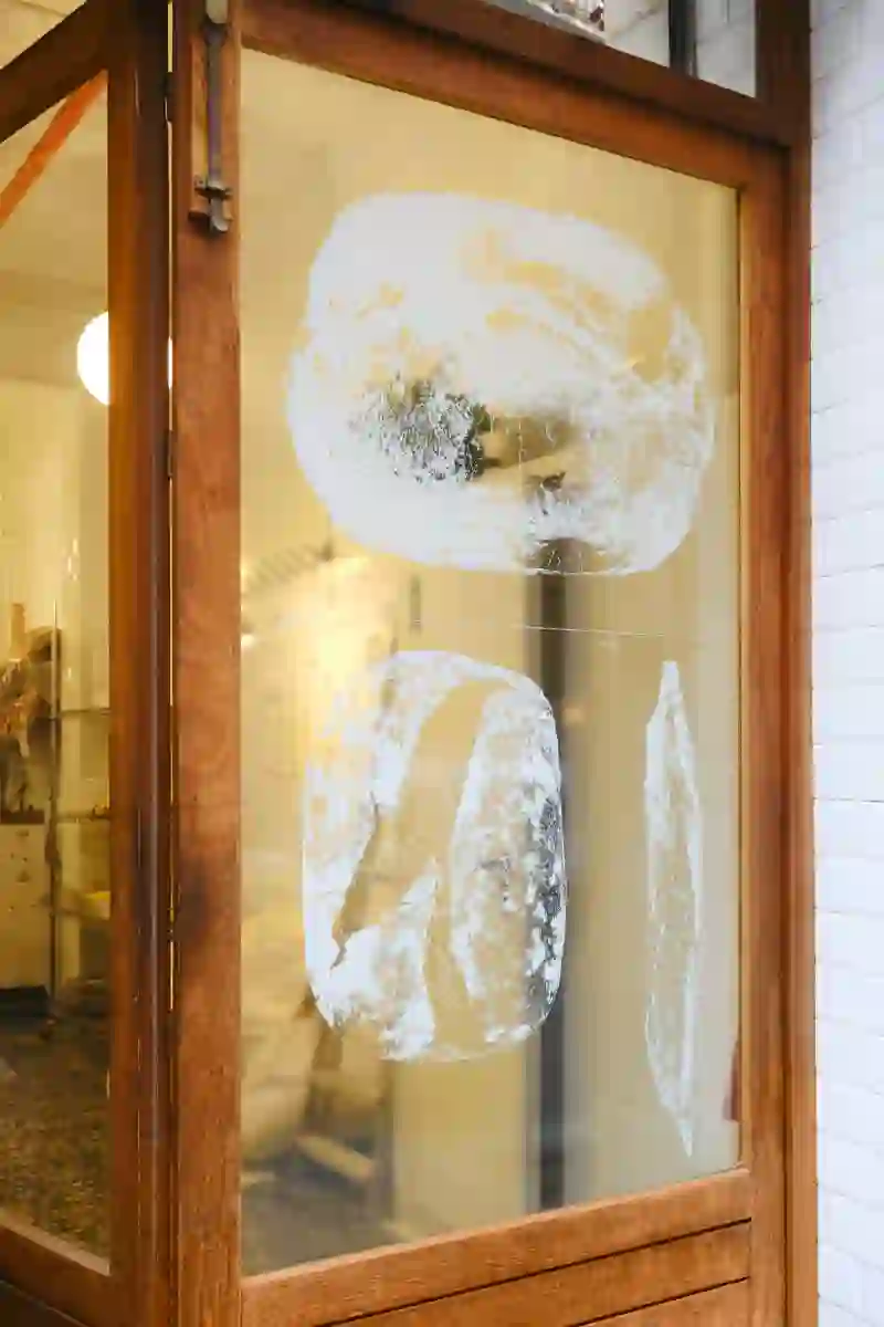
Window
5 - 8
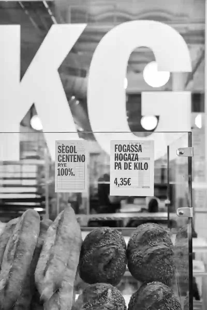
Signage
6 - 8
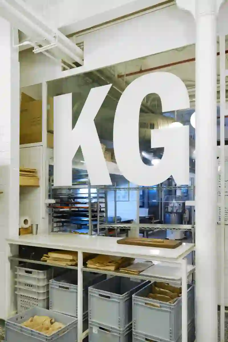
Sign
7 - 8
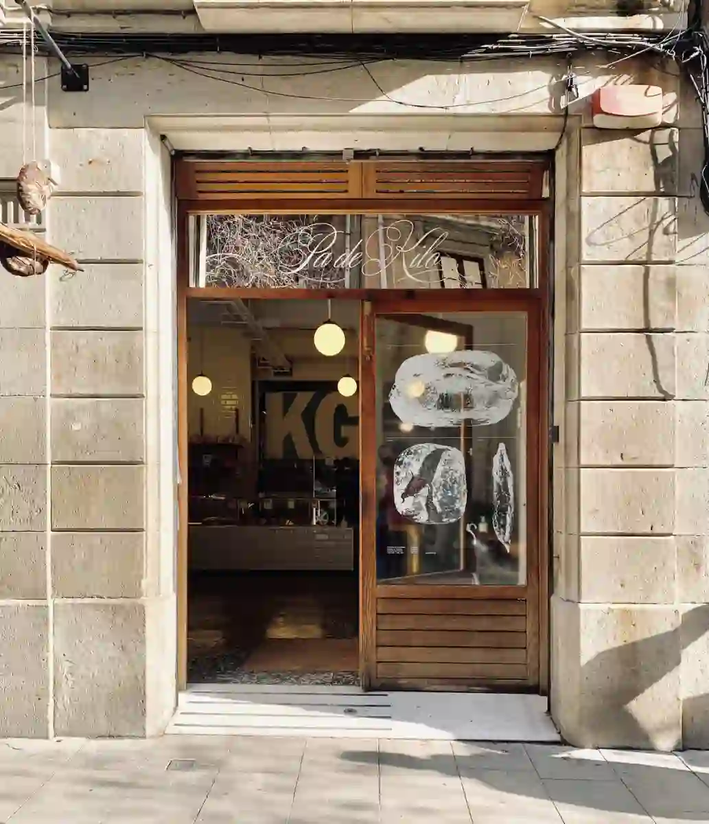
Front door
8 - 8
ENG
We were commissioned to create the identity for a small bakery in the center of Barcelona where bread would be made using a traditional recipe, sourdough, and organic ingredients. We had to find a name and an identity.
We saw that strategically we had to position the brand as a very traditional bakery with a touch of modernity but without going overboard. It had to be authentic because the bread they make is. We didn't want it to have the look of a hipster pastry shop full of cookies.
The creative decision was to work on the graphics as they were done in the past. In the past, businesses had a logo, but often you would see variations depending on where you saw it. For example, they had a logo on the facade, but on the invoice, the name was written with a different font. Or if they made a promotional merchandising asset, since the printer was different, they used a different font.
So, this was precisely the procedure; we designed as minimally as possible, and for each asset to design, we used the resources available to the one producing the asset. For example, the sign was hand-painted with a brush, the signage was made using old paper receipts, and for merchandising, we went to the embroidery shop and asked what fonts the embroidery machine had in stock and used one of them.
The result is an identity without identity, where the specific weight of the brand lies in the name PA DE KILO, as the brands did in the past.
The name comes from how the standard 1 kg bread is called in Catalonia.
CAT
Ens van encarregar la identitat d'un petit forn del centre de Barcelona on es farien pans fent servir una recepta tradicional, massa mare i ingredients ecològics. Haviem de trobar un nom i una identitat.
Vam veure que estratègicament haviem de posicionar-nos com un forn molt tradicional amb un punt de modernitat però sense passar-se. Que fós de veritat perquè el pà que fan ho és. No voliem que tingués aspecte de pastisseria hipster plena de cookies.
La decisió creativa va ser treballar la gràfica com es treballava antigament. Abans els negocis tenien un logotip, però sovint veies variants depenent de la peça on el veies. Per exemple, a la façana tenien un logo però a la fulla de factura hi havia el nom escrit amb una tipografia diferent. O si feien alguna peça promocional de merchandising, com que l'impressor era un altre, ho feien amb una altra tipografia.
Doncs aquest justament va ser el procediment, vam dissenyar el mínim possible i per a cada peça a dissenyar feiem servir el recursos dels que disposava qui produïa la peça, per exemple, el rètol es va fer a mà, pintat en pinzell, la senyalització es va fer aprofitant antics rebuts de paper, per al merxandatge anavem al brodado i li preguntavem quines eren les tipografies que tenia de serie la màquina de brodar i ho feiem amb una d'elles.
El resultat es una identitat sense identitat on el que té el pes específic de la marca és el nom PA DE KILO, com també passava antigament a les marques.
El nom ve de com s'anomena al pà standard d'1 kg de pes a Catalunya.